I’ve had a credit card now for about 2 years, so I thought I would make a cool visualization that shows my relative spend through out the year on a daily basis. I think this plot came out to be relatively cool.
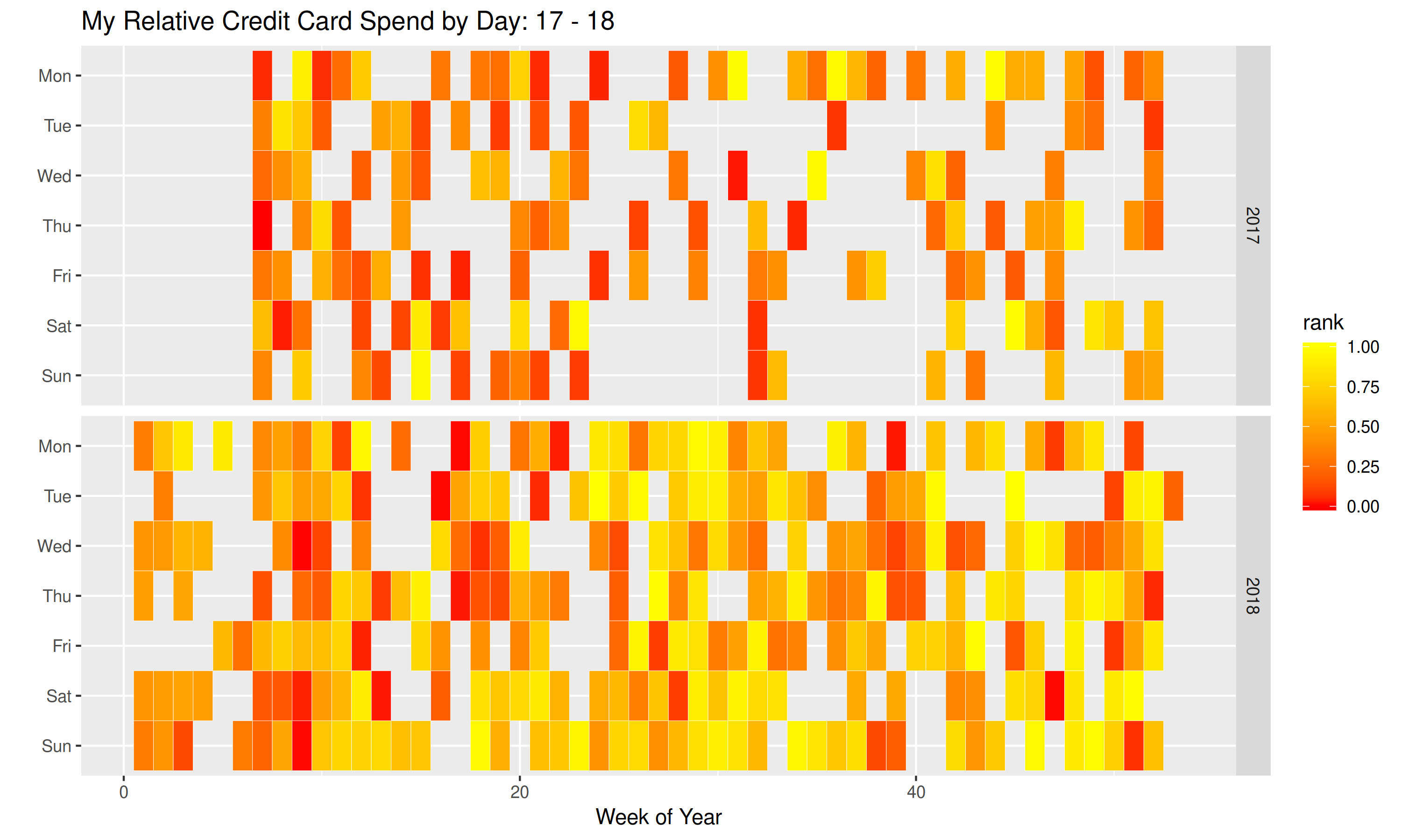
The color in the chart is determined by the percentile rank of spend for that day. This is to help anonymize my information. As you can see my spend was much higher in 2018, especially towards the later bit as I had my summer internship, and started working more. I also spent much more consistently over 2018. My goal for 2018 is to spend much less frequently and in smaller amounts.
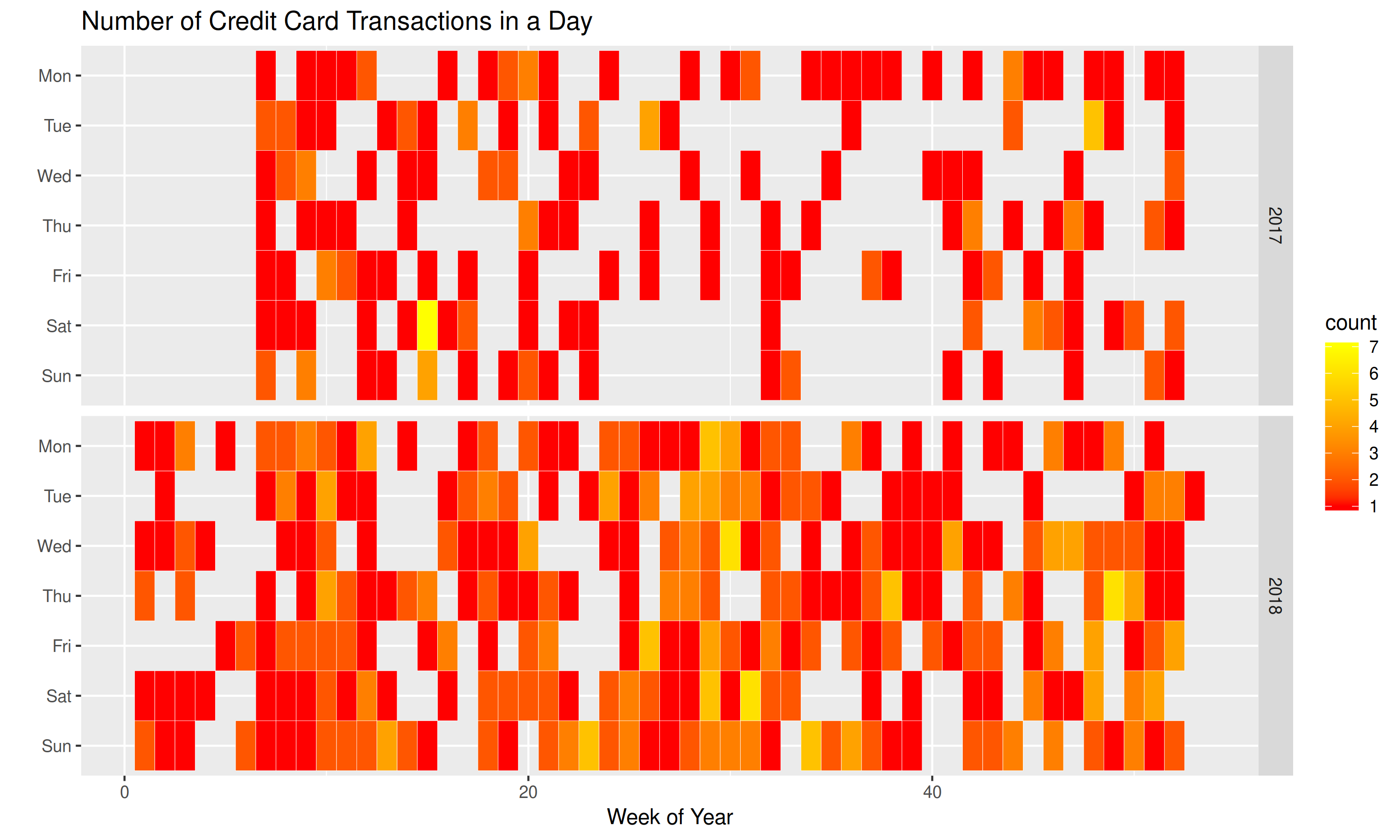
I also generated a chart showing how many transactions were posted to my account in a given day. I really wish that the data came with a swipe date, and the post date. Credit cards are weird about when things post, but that’s the name of the game.
So this is some interesting data. It’s also like taking a stroll down memory lane to see where I spent my money.
Code
The data structure of my dataframe is as follows. It contains an aggregate of
a day’s transactions. The rank column is the percentile rank of the
overall spend for that day. The count column is how many transactions
posted that day.
str(a6)
'data.frame':	400 obs. of  12 variables:
 $ date      : Date, format: "2017-02-12" "2017-02-13" ...
 $ year      : num  2017 2017 2017 2017 2017 ...
 $ month     : num  2 2 2 2 2 2 2 2 2 2 ...
 $ monthf    : Ord.factor w/ 12 levels "Jan"<"Feb"<"Mar"<..: 2 2 2 2 2 2 2 2 2 2 ...
 $ weekday   : num  1 2 3 4 5 6 7 2 3 5 ...
 $ weekdayf  : Ord.factor w/ 7 levels "Sun"<"Sat"<"Fri"<..: 7 6 5 4 3 2 1 6 5 3 ...
 $ yearmonth : 'yearmon' num  Feb 2017 Feb 2017 Feb 2017 Feb 2017 ...
 $ yearmonthf: Factor w/ 24 levels "Feb 2017","Mar 2017",..: 1 1 1 1 1 1 1 1 1 1 ...
 $ week      : num  7 7 7 7 7 7 7 8 8 8 ...
 $ monthweek : num  1 1 1 1 1 1 1 2 2 2 ...
 $ count     : int  1 2 1 1 1 1 2 2 2 1 ...
 $ rank      : num  0.0476 0.3409 0.2456 0 0.2982 ...
I grabbed my data from my American Express card. Their data export tool for transactions is awesome. I highly recommend them. Please use my referral link.
library(ggplot2)
library(dplyr)

# Chart 1
p <- ggplot(a6, aes(week, weekdayf, fill=rank)) +
	geom_tile(color = 'white') +
	facet_grid(year ~ .) +
	scale_fill_gradient(low="red", high="yellow") +
	xlab("Week of Year") + ylab("") +
	ggtitle("My Relative Credit Card Spend by Day: 17 - 18")

# Chart 2
p <- ggplot(a6, aes(week, weekdayf, fill=count)) +
	geom_tile(color = 'white') +
	facet_grid(year ~ .) +
	scale_fill_gradient(low="red", high="yellow") +
	xlab("Week of Year") + ylab("") +
	ggtitle("Number of Credit Card Transactions in a Day")